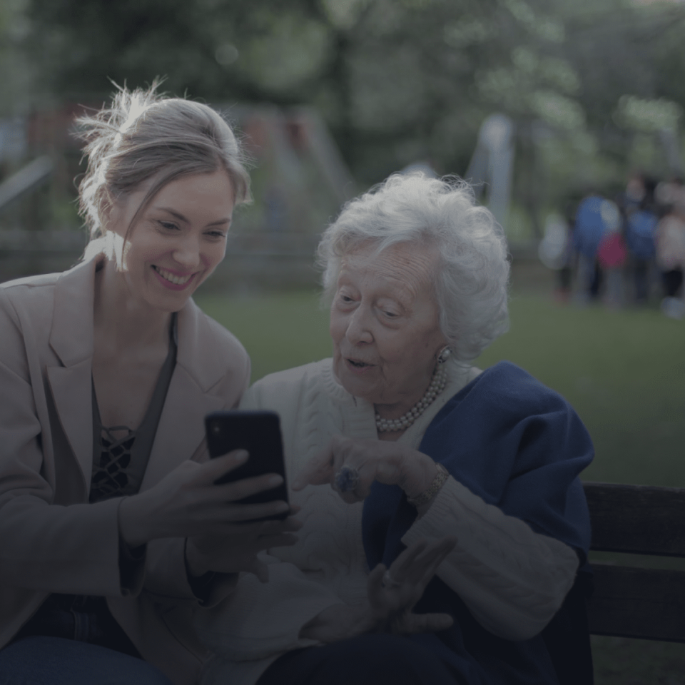
While building our product designs, we often omit incorporating resources and accessibility for an important section of users: the older Adults.
Why is there a special consideration in UX designing for the elderly?
The older population in our society has special needs that may not be required by us. For example, cognitive ability depreciates after a certain age. This results in older people requiring more time to read, understand and even see the words. Thus, ageing becomes a factor in hindering engagement as a user. They may require voice assistance, commands and bigger/bolder texts.
As UX/UI designers, it is our duty to ensure that our design has the option to adjust these features so that it is usable by everyone.
Another factor to consider is that most people above age 60 have spent their lives mostly without the Golden products in Technology. Their use with mobile devices, apps have been fairly new. Thus, many elderly people are not comfortable with learning and incorporating these technological changes into their lives. For those who do, often find it difficult to use the product due to inaccessible UX/UI Designs.
How can we make our designs accessible to the elderly?
Overall User Journey Approach:

- The designs should be easy to function. Higher functioning designs that includes adding images upto certain sizes, formats creates difficulty to be used by older people.
- Avoid asking to input information in different formats and files.
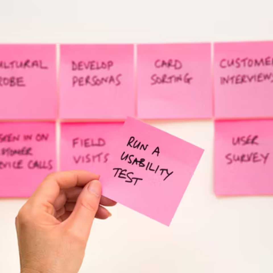
- Technology can be used to enable things – but the feasibility of usage will depend on the journey. Regularly testing on the elderly can ensure that the user journey is smooth and easy.
- Increase human interaction wherever possible. Provide video help, voice instructions to help. Many booking apps have started to use ‘book by calling’ as a method provided in the app. This has ensured a higher feasibility for older adults.
Texts:
- Ensuring that the text size is adjustable. These days, devices usually have a touch option to zoom in the text which helps our content to be accessible.
- Making sure that the text font use is readable and aligned.
- The text should be clear with enough spacing to not confuse, jumble and mix words.

Colors:
- It is ideal that the colours used are accessible for colorblind users.
- It is important to ensure that color schemes used are familiar. for example, using red for troubleshooters etc.
- Ensuring that the palette and contrast is extremely clear and the text is not being hidden because of the colour. Eg. using black text over deep colour buttons.

Visual Aids:
- Providing instructions and arrows for first time users is really helpful for the users who are new to the design.
- Navigating indicators that allows the user to see which section of the product they currently are using or entered.

Avoiding Time-based Tasks:
- Using limited time such as for OTPs can be extremely difficult for older users.
- It is a hassle for people with motor disabilities.

Icons:
- The size should be increased for older users, especially with motor disabilities.
- Ensuring that there is text written on the buttons and icons.

More:
- It is really helpful to provide suggestions and examples for every task.
- Using clear instructions instead of abbreviations.
- Using texts more than symbols, animations.
Conclusion:
As designers, it is our job and ethic to build platforms that are inclusive of different users. It takes extra concerns, efforts to reach accessibility but it is extremely important to ensure that we are prioritising our users.
Often, researching different types of users and their needs can really help us achieve that goal. User testing is also another great way to find out issues and solve problems.
For User Testing: http://184.72.144.168/design-process/how-to-test-your-ui-design/
Eventually, all these efforts will lead to building a design usable for all.


Accessibility is a well-known topic that all designers are familiar with. Moreover, I believe we all try to obey the rules, designing our websites, apps, and services to be accessible to everyone, btw a very helpful article, Thanks.😊