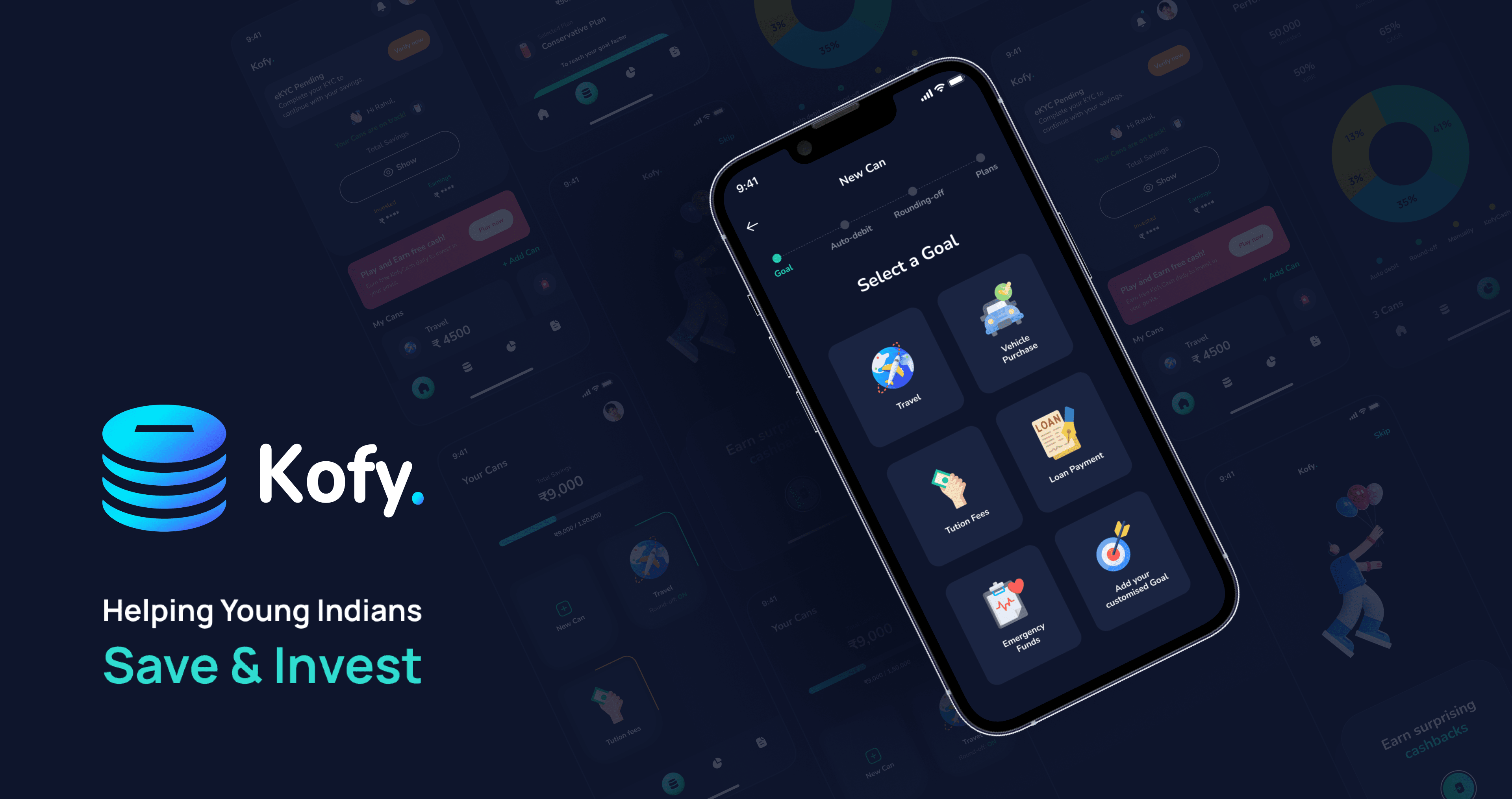
The idea was to build an App for users to save money for their needs like Tuition fees, Vehicle Purchases, Travel, Emergency funds, etc. as nowadays it is not easy to build a regular savings habit because sometimes people forget to save and worry more about the expenses, or they can’t find a proper platform to save money for future.
So here we have designed an App from which users can register themselves and start adding money to their Cans by selecting a goal & plan. Not just that users can enable the Rounding-off feature so if they forget to add money to their Can, a little amount of money (Rs. 7- 10) will be deducted from your bank account and will be added to the user’s Can during a transaction.
This project was done by Surgyy Design Labs, and the below case study highlights key aspects & objectives of the work process.
Objectives
- Build a regular savings habit for users to save money for their future goals.
- Higher and faster goal achievement rates.
- Savings for a purpose without feeling the pinch.
- A user-friendly interface with a little touch of gamification style as it excites the user to use an App.
- More advantages for users on saving money like getting some extra amount of interest on their goals.
Motivation factors for Users
When we were designing this App, we kept some points in mind so that we don’t have to lose track of our main objective which is Motivation for Users.
- The App should be designed in a way that the user should stay motivated while using it.
- We have added the Badge feature for users as they can unlock more Badges by saving towards their goals.
- Saving money for their goals can earn users some extra amount of interest to keep a difference by saving on Kofy.
- A better user experience can lead users to stay motivated as they know what they are doing.
How User can set up a Goal in minutes.
After many ideations & interactions, we came up with a short process of creating a User’s Can.
- Select a Goal & Target Amount: The user can select from a list of specific goals like Vehicle Purchase, Tuition Fees, Travel Journey, Emergency Funds, etc. and need to select a target amount to save.
- Setup Auto-Debit: The user can set up an auto-debit for Daily, Weekly, or Monthly for a particular amount.
- Rounding-off: Enable Rounding-off for the goal for a little amount of Rs 7 or 10 as it can be deducted during the transaction.
- Select a Plan: The user has to select from given Plans which are Conservative, Balanced, and Aggressive as these address the risk and return percentage of the goal.
- Goal Summary: Review the selections from previous steps and then boom, Can is created!

This was our main concern.
UX Research
As we have finalized our main objectives, then we jumped to some research as there are competitors which are providing some common functionalities so we need to identify their process of how they are doing for users and how we want to do it.
We curated some of the competitors based on the idea and we found some which are doing good in their place.

We have taken these as our prior competitors as they are also providing some common functionalities which we were going to provide.
Then we came up with many concepts and ideas of how we can do a good difference from our competitors by collecting some more references.

Some Hand-drawn Sketches Before Going Digital.
When we face challenges of how the Product will go well, we pick a pen & paper to start drawing our ideas as we believe this is a fast process of getting ideas into the mind.


Branding
After Sketching & creating lo-fi wireframes, we head for Branding as it the main thing to concern for a successful Product to be among the competitors.
First we came up with a better Logo concept where we have to tell the story of our Product in a Logo.

Logo Variations


Style Guide
As many iterations & meetings with our Customer, we came up with a better Color Palette & Typography.


UI Screens
This is where the Product is highlighted as we have designed the High-fidelity UI Screens with all the use cases.

Home page & Hero Area of the Mobile App
Few Key Elements in the top area of the Homepage:
- A pending e-KYC Notification for user’s who have reached a limit & need to do a e-KYC. This notification precedes to the top of the page.
- The welcome message along with “Your cans are on Track” indicating that the savings are debiting as expected
- Total amount of the user’s savings are “Hidden” until the user presses the “Show” button. This is to provide privacy, as users discuss the App with their personal circles.
- “Play & Earn Cash” is another notification that comes in the landing areas of the homepage, after the main hero / welcome area.


Looking to get a Mobile App or Web App Designed by Experts? Check-out Surgyy Design Labs here
